

Calls to action (CTAs) are prompts that you place on your website to tell people what to do as they interact with your site. They can be very effective at helping you get more conversions because they guide visitors into taking the required action that will make them convert.
But you shouldn’t just use CTAs for the sake of doing so. You should be aiming to create CTAs that will improve the chances of you getting more leads and conversions. So, in this guide, we will take a look at six tactics that can help you ensure your website’s calls to action will get good results.
Make them eye-catching so website visitors can’t miss them
The design of your CTAs is not less important than the wording. You don’t want them to blend in. This means readers are less likely to spot them. So, you need to put some thought into making them stand out. Ideally, you should be going for bright and bold colors like red, orange, or purple.
Also, try to place them against cool-colored or white backgrounds so that people will see the CTAs immediately after they land on your site. You might even want to test different shapes and sizes of CTA buttons so you can find the ones that work best for the different pages on your website.
Here’s an example of a site that does well in making its CTA very noticeable to website visitors.

SocialPilot is a marketing tool that helps people manage their presence on social media platforms. On their website, they have a page that talks about captivating LinkedIn tools you can use to improve your LinkedIn marketing. And, on the page, you’ll see that they’ve found ways to include their CTA so it stands out.
They use bright orange as the color for the CTA button and place it against a white background so it’s very visible to anyone who arrives on the page. Also, they’ve placed the CTA in different positions — above the fold, on a banner at the right side of the page, and at the end of the page. These are very strategic positions that increase the chances of visitors seeing their CTAs and taking action before leaving.
To do the same for your website, you can try positioning your CTAs at the top, middle, and end sections of your web pages to see if it affects the number of conversions you get.
Ensure your calls to action have plenty of personality
You want your prospective customers to really engage with your CTAs, and injecting them with personality can help with that. However, in order to inject personality into your CTAs, you need to identify your company’s brand voice. To do this, you want to develop a brand persona.
A brand persona is essentially a fictional representation of your company that allows you to view your brand the way you want customers to perceive you. Do you want to sound cheerful and quirky? Or are you going for a professional and serious look? Once you pick the personality you want your brand to have, it’ll make it easier for you to start creating copy (CTAs included) in a tone of voice that fits the way you want your business to sound.
To give you some inspiration, let’s look at a company that does a great job of portraying personality through its CTAs.
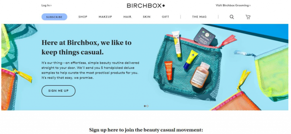
Birchbox is an online subscription service that sells items like make-up, as well as hair and skin products. Looking through their website, you’ll see that they’ve decided to adopt a fun and casual tone of voice for their brand. The CTA on their homepage is prefaced with text that shows just how relatable the brand is and they speak in a very casual tone that would help many prospects connect with the brand.
The CTA itself is also very casual. It simply says “sign me up” and does a great job of speaking directly to their audience in a chatty and fun voice that can encourage people to buy their products. It’s a great example of how you can inject personality into your site’s CTAs. And, to show that you know what you’re doing, try to focus on using action-oriented CTA copy that draws your audience in and compels them to convert.
Provide different calls to action for different audiences
The people who visit your site might be at different stages of their buying journey. This means you should be creating different CTAs that correspond to the different stages. For instance, you might want to tell one person to make a purchase, but encourage another to give you a call for more information. To account for this, it can be worth including multiple CTAs on the same web page.
To give you an idea of how to display different CTAs, let’s look at the way we’ve implemented this tactic on our website at Loganix.
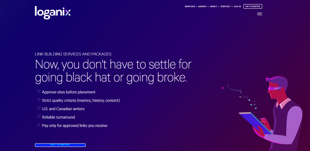
On the service page for our link building services, you’ll find that we’ve included multiple CTAs for different people. These include “get started”, “read case study”, and “learn more”. These CTAs do an excellent job of speaking to our website visitors who are in different stages of their buying journey.
The “learn more” prompt applies to those who need more information as they might just be discovering our site. The “read case study” CTA is for people in the decision stage of their journey who want to see evidence that we’ve achieved excellent results for past clients. And then we have the “learn more” prompt for those who have made up their mind to contact us so we can get started on their link building needs.
By creating multiple CTAs to appeal to different audiences, we’ve been able to make sure that every visitor has an action to take and isn’t left wondering what to do on our site. You can emulate this technique by creating several calls to action that will speak to the different visitors on your site. When you do this, also try to spread them out at different strategic positions on your page so your readers won’t miss the chance of finding the option that best applies to them before leaving your site.
Aim to create a sense of urgency
Creating a sense of urgency makes consumers feel like they’ll miss out on your offerings if they don’t complete the action right then and there. This can lead to more people taking the desired action right away. To create a sense of urgency with your CTAs, you can try using words that suggest your products or services might not always be available in the future. By doing this, you’ll be prompting prospects to leave the fence and act fast if they don’t want to miss out on what you’re offering.
To give you a practical example, here’s how Ping Identity uses a CTA to create a sense of urgency for readers.

Ping Identity provides an identity and access management solution for businesses. On their website, they have a page that explains their single sign-on solutions for different applications and, at the end of the page, they include a CTA that aims to trigger a sense of urgency in their prospective clients.
The CTA mentions how the world is rapidly evolving and urges readers to act now if they want to stay ahead of the curve. It speaks directly to people who might still be on the fence about contacting the company by reminding them that we live in a digital world where things are always changing so it’s best to take action now if they don’t want to be caught out.
This is a great example of a CTA that can create a sense of urgency in prospective customers and you might want to use the same technique. You can also try offering discounts in your CTA and setting a time limit for the discount so people are motivated to buy your products or services before time runs out.
Make it clear if you’re offering something for free
Everyone loves a freebie. So, if you’re creating a CTA to promote something that won’t require the reader to spend any money, make that very clear. This can work for the likes of free templates, a free trial, or a free consultation.
Offering something for free is also a great marketing tactic in general, as it shows people what you can do, and is likely to lead to them spending money with you or being loyal to your business.
Now let’s study an example of a company that knows how to highlight the fact that they’re offering something to their audience for free.
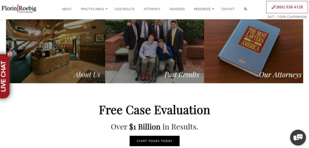
Florin Roebig is a team of personal injury and car accident lawyers and, on their homepage, they make it very clear that they offer a free case evaluation. They highlight the words “free case evaluation” in bold font and then include a CTA button that says “start yours today” to encourage people to arrange a free case evaluation with the firm.
It’s a great way to get visitors to take action on their site since people would be happy to get the free service without making a financial commitment. And you can do something similar for your site by highlighting the fact that you offer a free service or a free trial period that doesn’t require people to pay for your product or service.
Play on your website visitors’ fear of missing out
The fear of missing out can be a very effective motivator, so it’s worth playing on this with your calls to action. Make your readers feel like people just like them have taken your desired action and are much better off because of it.
This will encourage them to worry about missing out on something special and will push them towards making a purchase or taking your desired action. To give you some inspiration, let’s see an example of a website that inspires the fear of missing out with its CTA.
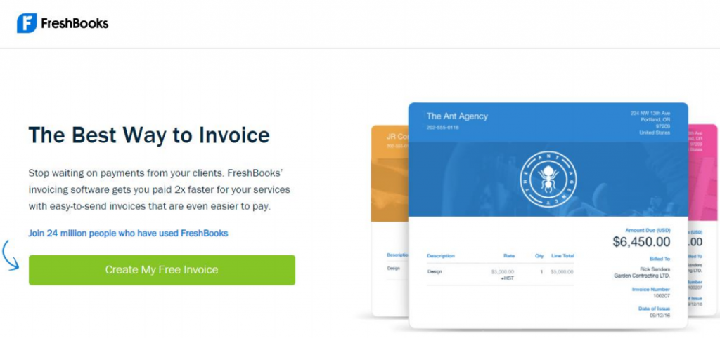
FreshBooks is a company that provides an accounting solution for small and medium-sized businesses. On their website, they offer a free invoice template that people can use to bill their clients for services rendered. As a way to tap into their audience’s fear of missing out (FOMO), they’ve included text telling readers to join the 24 million people who are already using FreshBooks.
This is a really good example of a CTA that shows their website visitors that there are already many others who are using this solution to make their lives better. And it can be the motivating factor that prompts prospective customers to take action. You can also benefit from using this tactic on your site. Try including the number of customers you’ve served over time to trigger the FOMO in your potential clients.
Summary
When creating calls to action for your website, aim to publish action-oriented and catchy CTAs that will prompt people to take action that can lead to more conversions for your site.
And, to do this, you should focus on giving your CTAs plenty of personality, using them to create a sense of urgency, and also playing on your visitors’ fear of missing out. Once you’re able to implement the tips we’ve outlined in this article, you’ll be on your way to creating effective CTAs that will give you better results.
Author bio:
Aaron Haynes is the CEO of Loganix, an SEO fulfillment partner that supports marketing agencies and professionals. The company specializes in helping businesses to improve their online visibility and ultimately make more sales. The Loganix blog has a lot more information and advice, so make sure you check it out if you found this article helpful.