Table of Contents
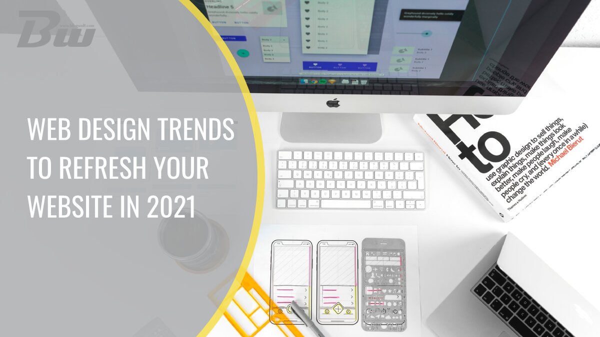
2021 has been and continues to be a wild ride for many people. With trends fading into obscurity just as quickly as they came into existence, it can be overwhelming. In order to help you be up to date, we decided to compile this short list of trends that seem to still hold fast in 2021. So keep reading, as we are going to go over the 6 web design trends and ideas for 2021, and for the best design, you can always hire one of the best web design agencies in Egypt.
Web designers can stay ahead of the curve by exploring current web design trends and ideas to refresh your website. Incorporating elements such as minimalist aesthetics, microinteractions, and bold typography can give your site a modern and engaging look, capturing the attention of visitors and enhancing user experience.
Minimalism
Minimalism definitely isn’t anything new, but it has been slowly picking up steam ever since 2017. As concept minimalism deals with removing unnecessary clutter, and in doing so, focuses on the essence of something. Because it’s so simple to understand, many people choose to live a minimalist lifestyle and, in turn, resonate with other minimalist media. Because of this, minimalism has seeped into our web pages. When discussing minimalism in web design, with colleagues or a web design agency, different people will have different ideas, but the basic principle of less is more holds strong.
Not only is this a great aesthetic choice, but creating a minimalist page also has performance benefits. By creating a relatively simple website with minimal use of images, you will drastically improve the site speed. This topic of simplicity brings us nicely to our next point.
More prominent use of colors
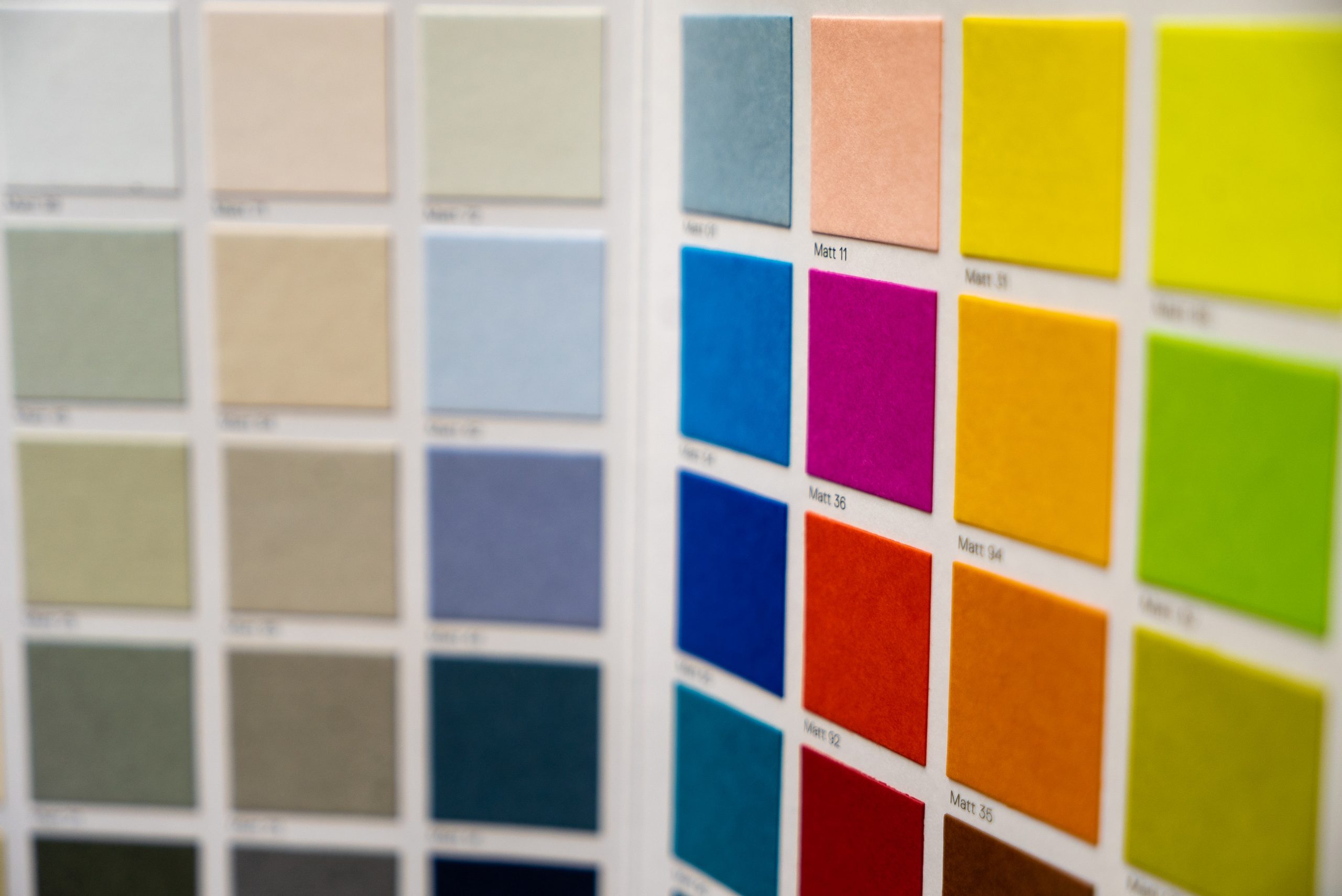
Once again, we can see the resurgence of old design trends. But what was once done out of necessity has now become a choice, and boy does it look beautiful on some websites. By limiting yourself to a small range of colors and simple graphics, people are creating websites that pop. While this does seem pretty easy at first, creating a website like this is pretty difficult as it requires an understanding of color theory.
So if you have a few hours to spare, we suggest reading up on color theory so that you can create a great-looking website, and if you don’t, there is no reason to worry. One word, Monochrome. Many websites pull this off stunningly, and it requires far less effort while still being trendy and looking great.
Horizontal scroll and one-page design
The first time that I saw someone utilize horizontal scrolling on a website, I was blown away. This simple thing can completely change the feel of a website. How you might ask, and to be honest, I’m not completely sure. Having said that, I’m not the only one that thinks this, as many websites started utilizing horizontal scroll. But before you decide to redesign your website, going with a horizontal scroll option is something that you should commit to.
Meaning that you should use it in combination with the one-page design philosophy. Anything less makes it feel pretty half-baked. And since we mentioned a one-page design already, make sure to keep it as concise as possible since people don’t like scrolling for too long.
Mobile version

While website versions for phones used to be a gimmick, ever since 2019, people have started creating dedicated versions of websites specifically for mobile devices. This is a pretty logical course of action, considering that smartphones have become such a staple of our daily lives. Because of that having a mobile version of your website has become a must. Now, if you are one of those late bloomers, I suggest whipping up a mobile version for your website as quickly as possible: Thankfully, a plethora of tools can help you build a mobile version. Or you can utilize WP themes that do this automatically.
Animations
Another small tweak that can easily add so much personality to a website is animations. By adding animations to certain parts of your website, like buttons or images, you draw the attention of your visitors to the parts of the screen that you want them to see. While this is proven to work, it should be used sparingly for a few reasons. The first of the big two is that too much going on simultaneously overwhelms your visitors, making the animations less striking. And the second one being that it tanks website performance, so in order to keep load times down, I would suggest limiting yourself to only a few animated do-dads.
Tip jars

Now, ever since Patreon became a thing, people started being a bit more generous with their funds. Because of that, it is prime time to create an online tip jar, and with services like Buy Me a Coffee, that has never been easier. If you are a company, please don’t do this, but if you are a small blogger or content creator, this can provide you with a sometimes much-needed boost of motivation. Not every visitor is going to donate, and that is a fact, but the 5% that have disposable income will surely make your day.
A few don’ts before we wrap up
If you plan on using illustrations on your website, steer clear of the Alegria style of illustrations and its many lookalikes. While there is nothing inherently wrong with the design of these illustrations, as of recent, they have started to saturate the online space. While this art style was designed to be appealing and inclusive, its rampant use by big tech companies has given it a bad connotation.
Labeled now as “Corporate art,” it gives off the “I’m a pompous tech company, give me your money” vibe. Shotgun round, don’t autoplay videos, don’t use flashing colors, don’t use popups, and for the love of God, don’t use Comic Sans as your font of choice.
In conclusion
While all of what I said is true, it should be taken with a grain of salt. Just because these things are trends doesn’t mean that they will make your website an instant hit. Rules and suggestions should sometimes be broken and disregarded. If you have a great web design company and an idea about how to make a page but completely disagree with the points that I made, all the power to you. Sometimes the pages that deviate the most from trends turn out to be the best ones. Because of that, I suggest that you roll up your sleeves and that you go create a website that you can be happy with.