
Table of Contents
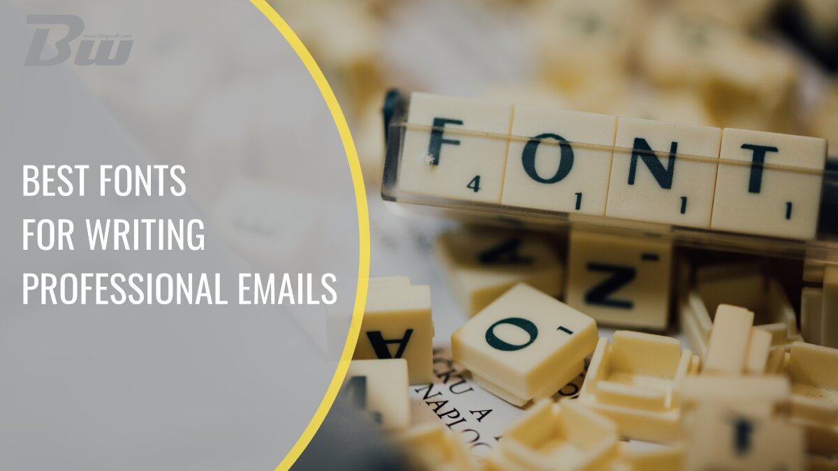
It is really powerful to be able to contact clients long after they’ve left your website. However, any old email will not suffice. The way you format your email content is critical for catching attention and persuading clients to read rather than delete your emails at first glance. Choosing the appropriate font is one of the most noticeable issues in the email production process. Weight, height, width, color, form, and spacing are all factors to consider.
Is it true that everything matters? Yes, but the most important thing is to pick a legible font; the rest of the font properties are minor. An email takes an average of 13.4 seconds to read. When illegible typefaces are used, it takes longer. Longer reading times result in dissatisfied prospects, which you definitely do not want. This article examines the 5 best fonts for email, ensuring that they are not only opened but also read. We will provide you relevant information on different aspects of fonts and also how to choose the right one for you.
Font Families
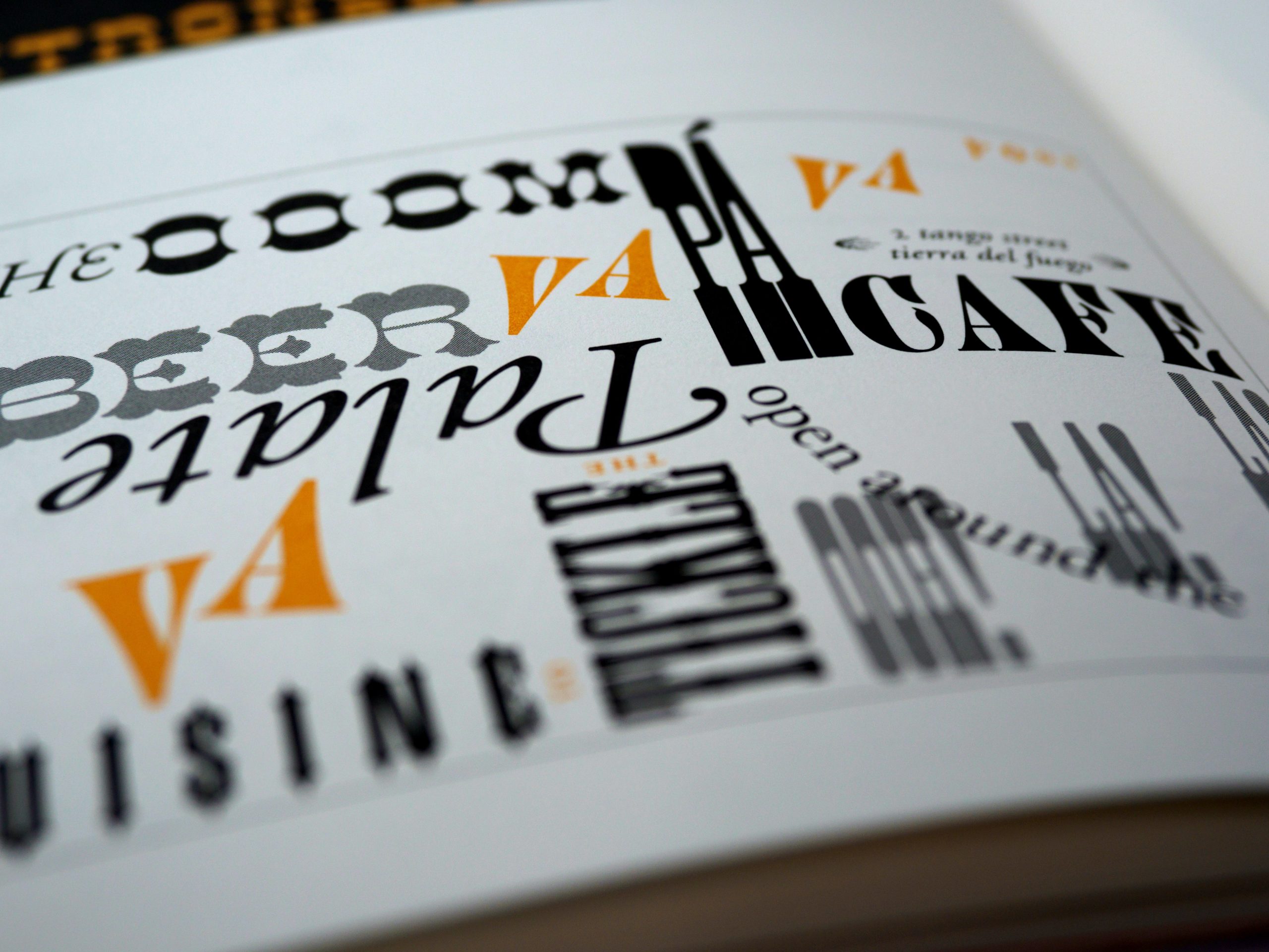
Serif, sans serif, display, handwritten, and monospace fonts are categorized to help manage this massive collection. They are popular on a large scale and the most used font families. Some fonts are functional, while others are exaggerated for certain purposes like graphic design. The email space does not include all font families. While using handwritten fonts to create an email may seem appealing, it is just not feasible.
System Fonts
You may use almost any font in your HTML emails, but recipients will only see fonts that are supported by their email clients and providers, even the choice of browser matters. The fonts you select must then be compatible with Gmail, Outlook, and other largely popular email applications. These are known as web-safe fonts, and using them ensures that your HTML emails will look exactly as you intended when they are received by subscribers.
System fonts, often known as “web-safe fonts,” are fonts that may be shown on any device or in any application. Only a few of the hundreds of font designs have been collectively embraced by the mainstream. Arial, Courier New, Georgia, Times New Roman, and Verdana are examples of universal typefaces.
1. Arial
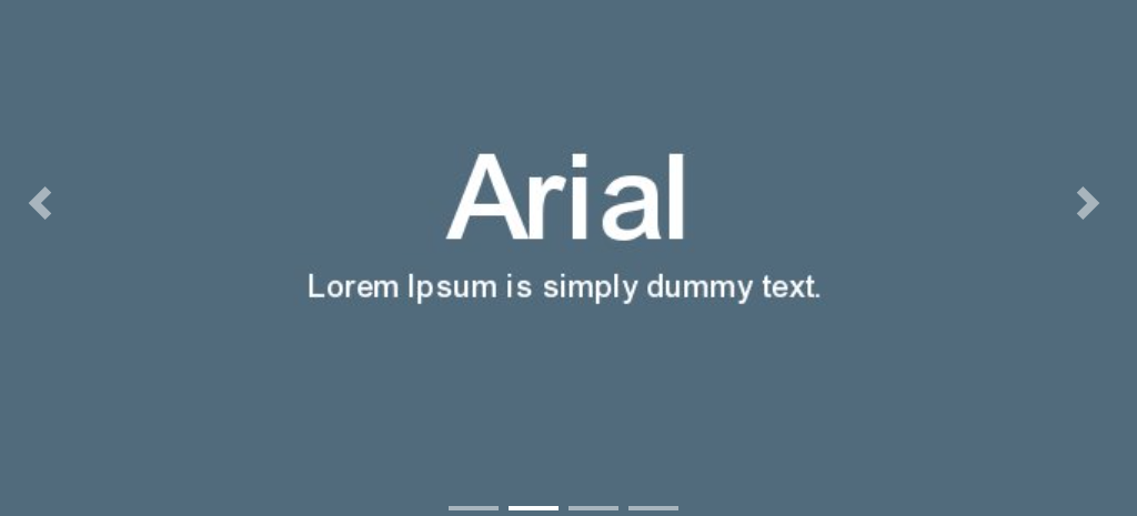
Arial is a popular sans serif font that may be seen in both print and digital media. The typeface is well-known for being adaptable, modest, and straightforward. Since this font is probably the most used font out there, if you want to stand out, perhaps you should consider choosing another one.
2. Times New Roman
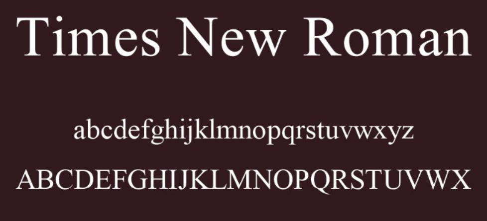
A British newspaper called The Times commissioned Times New Roman in 1931. The reader’s gaze is guided from one letter to the next by a strong serif design and contrasting line weights. Times New Roman’s popularity stems from the fact that it was the default typeface for every version of Microsoft Office and many other word processors until 2007.
In line with its traditional use for formal papers, utilize it for a serious, classic, and trustworthy tone. The new typeface immediately gained popularity among printers of the day due to its use in a daily newspaper. Typesetting machines have developed throughout the decades, but Times New Roman has always been one of the first fonts available for any new technology (including personal computers).
3. Verdana
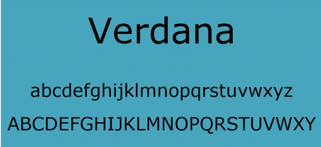
The Verdana typeface is a literal combination of the terms “verdant” (something green) and “Ana” and is named after its designer’s daughter (her name). It is a web-safe sans-serif typeface that’s very easy to read. Letters with similar shapes are made to seem different in order to improve overall readability. Because lowercase letters are taller than normal for this sort of typeface, it might be a good choice for ensuring that your sentence-case text is accessible to people of all ages and abilities.
4. Georgia
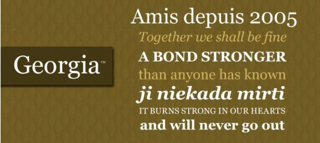
Georgia is a serif font that was created by Microsoft and is frequently used in newspapers and periodicals. Because of its widespread use, the typeface has gained a reputation for being authoritative and formal. It has large lower-case letters, thicker strokers than normal, and numerals that merge in with the text due to their comparable size. Because of the well-defined serifs and wide-spaced letters, Georgia is an excellent choice for lengthier email content.
5. Tahoma
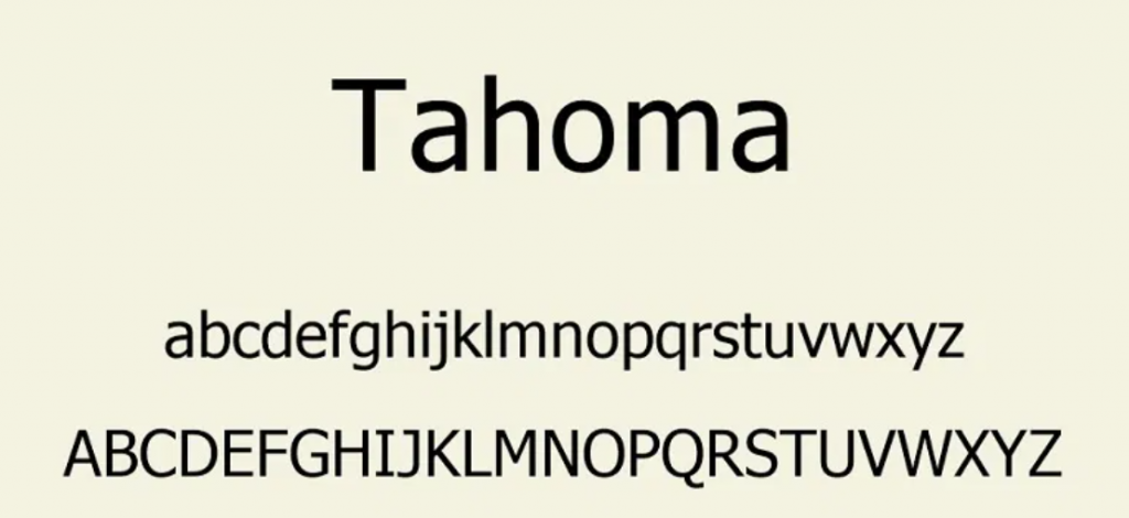
It features thinner letters, smaller counters, and tighter letter spacing than Verdana. For Windows 95, 2000, and XP, this is the default screen typeface. Tahoma, like Verdana, was designed with screen displays in mind. Tahoma is a sans serif typeface with upper and lower case letters that are generally equal in length. This improves reading and the overall appearance.
Final Thoughts
Using the proper fonts will help your advertisements stand out. By including branding and readability, you can ensure that readers will return wanting more from each delivery by ensuring that every component of the design is on point. When it comes to converting your audience, typography is crucial. When an email is opened, the appropriate font style improves readability and persuades your prospects to keep reading. You’ll be writing compelling emails in no time with our list of the best fonts for emails.